
Recess
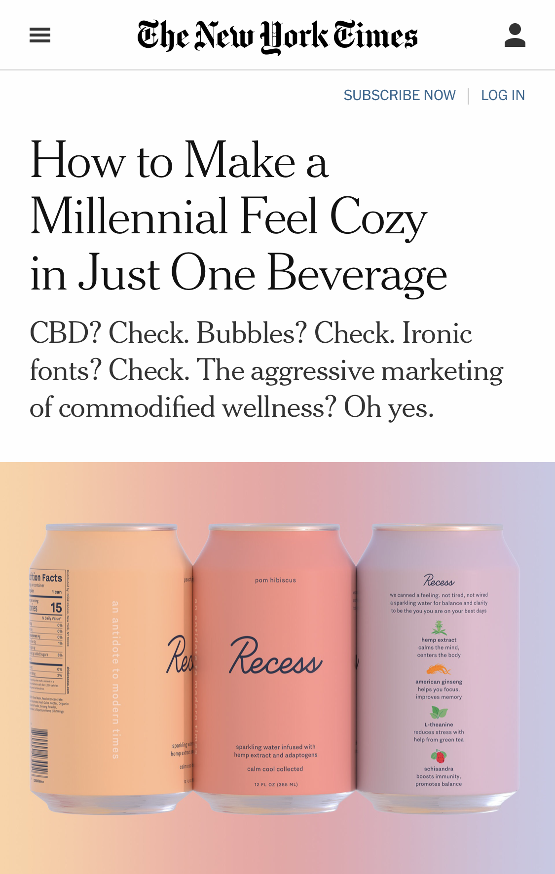
I designed the brand identity for the iconic CBD seltzer, Recess. It’s targeted toward busy millennials that are stressed out, over-stimulated, and over-caffeinated.
Taking cues from our favorite part of the day when we were kids, I designed the brand identity around the idea of how we’d like to feel after taking an “adult recess”— cool, calm, and collected.
My Role
Brand Identity
Packaging Design


Logo
The logo is hand-drawn from scratch, using a monoline for a refined and modern expression. The goal was to strike the perfect balance between calming and energetic.
Color & Typography
The color palette is soft and dreamy, evoking a sense of relaxation and enjoyment. The soft colors are juxtaposed with bold, confident typography.


Press
Recess was one of the first brands to launch in the era of CBD drinks and set the look and feel for this new category.


Recess Project Credits
Brand Identity and Packaging: Stine Nielsen
This work was created at Gin Lane. We also developed the Brand Strategy and Naming. The project team was: Camille Baldwin, Avery Houser, Emmett Shine, Rashi Birla
Website, Copy, Content, and further Brand Dev: Day Job
Portfolio images: Gin Lane, Recess, Day Job, and The Hub