
Equal Parts
As the creative lead at Equal Parts, I was responsible for bringing the brand to life from ideation to launch. I meticulously crafted the brand's visual identity, packaging, art direction, and product design to create a cheerful cookware brand that inspires intuitive cooking through its friendly and functional products.
Equal Parts draws inspiration from the rhythmic flow of jazz, the imaginative world of Paul Rand, and the creative process of cooking. The final result is a brand world that embodies playfulness, imperfection, and a sense of ongoing enjoyment.
My Role
Brand Identity
Illustration
Art Direction
Product Design & Development
Packaging Design
Logo
The logomark captures the essence of creative cooking, conveying a human touch and a positive, evolving spirit. The four swirls represent stove burners, cooking steam, and the blending of various ingredients and aromas.

Color, Typography & Graphic Elements
The Equal Parts world is colorful, funky, and fun. This comes to life through every aspect of the brand, from typography to colors, graphic elements, and illustrations. The overall effect is delightfully unpretentious, much like the approach one might take to cooking.


We commissioned Daniel Arnold to capture intimate scenes of groups of friends and families engaging in the act of cooking together.


The website is full of unexpected, playful animations, integrating the products with the illustrated world. Its unique approach stands out in a crowded market overflowing with polished and sleek cookware brands.


Physical Product Design and Development
As the creative lead for the Equal Parts product line, I collaborated closely with our ID partner, Branch. My responsibilities included proving design direction, selecting colors and materials, designing product details, innovating new products, and overseeing production at our manufacturing partners.

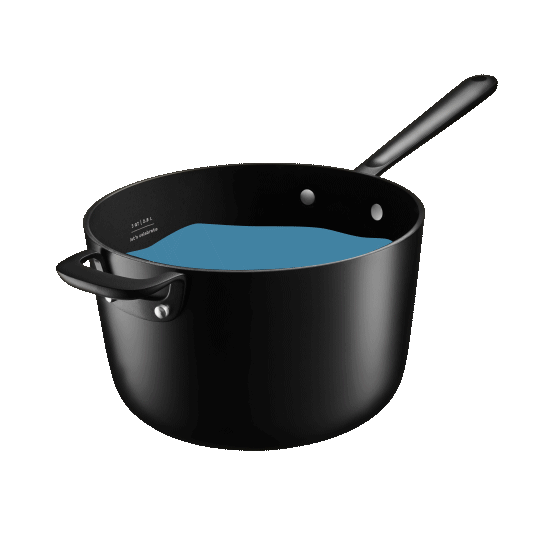
The products were designed with comfort and aesthetics in mind, featuring soft curves, a matte finish, and ergonomic handles for an elegant and approachable feel. We added playful details like meal measurements, pops of color, and a wavy cut-out on our fish spatula, creating a truly delightful cooking experience.


Packaging
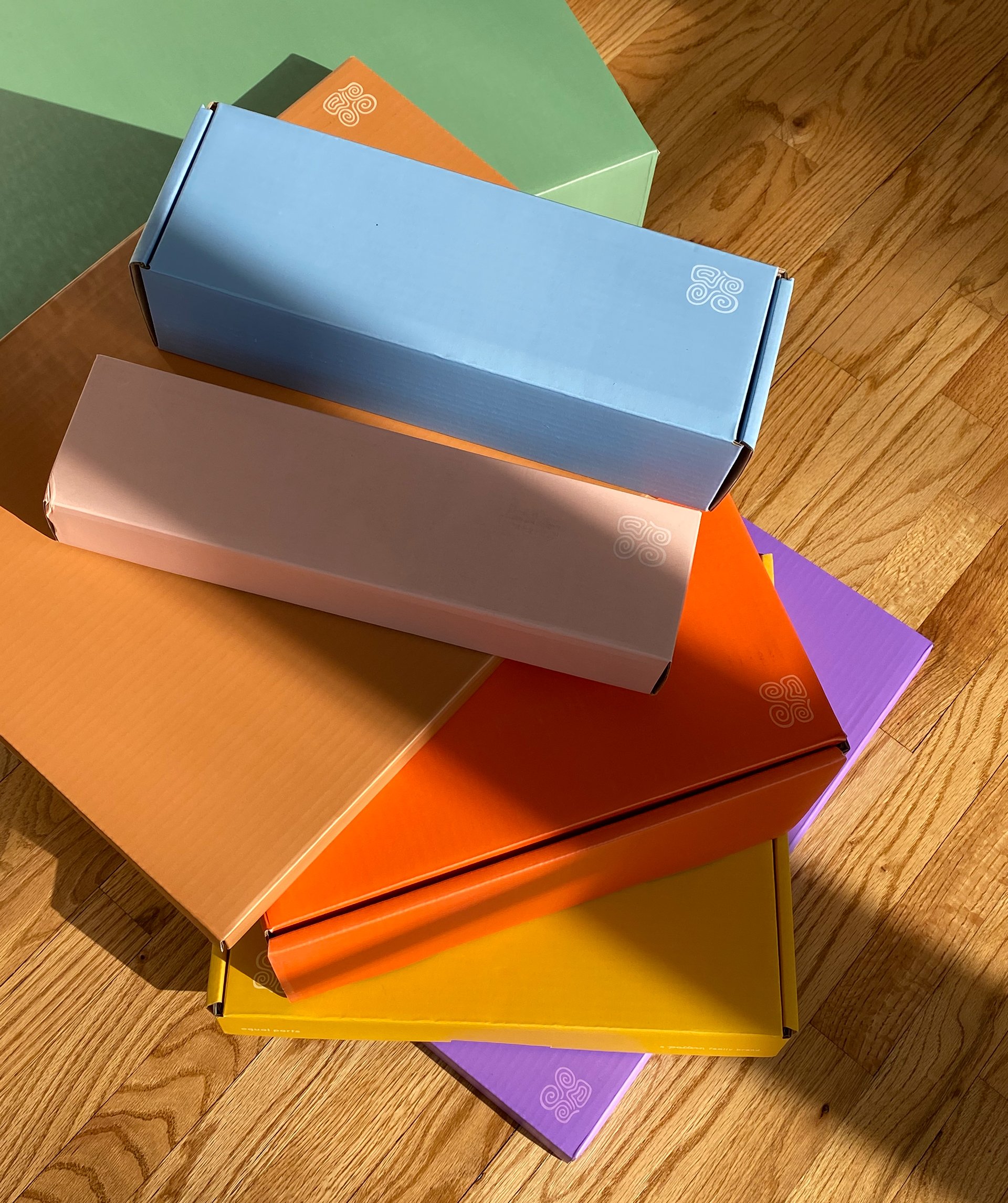
The packaging is more than just a protective casing; each item comes in a vibrant, colorful cardboard box that can be repurposed for storage once unboxed. The boxes also fit together like tetris blocks when shipped as a set, making for a playful and engaging unboxing experience.


Equal Parts Project Credits
Brand Identity, Art Direction, Packaging, Product Design- and Development: Stine Nielsen
Industrial Design: Branch
Product Development: Doris Dev
This work was created during my time at Pattern Brands. Big shout out to the whole team that made this work possible.
Product and Lifestyle photography: Daniel Arnold, Lauren Coleman, Daniel Dorsa